
Branding for the Franklin Mountains Region: Visual Identity That Doesn't Look Like Everyone Else
Most El Paso brands lean on the same three visual clichés. Here's how to build an identity that feels rooted in the region without looking like the neighbor's logo.
Open any El Paso branding mood board and you'll see the same three things: a stylized mountain silhouette, a sunset gradient, and a star. They're not wrong — they're just exhausted. A brand that wants to charge premium prices needs to feel premium, not familiar.
Lean into restraint, not iconography
The most distinctive El Paso brands of the last five years aren't the ones with the biggest mountain logos — they're the ones with the most disciplined typography, the most considered color palettes, the most generous whitespace.
Use the region as a feeling, not a picture
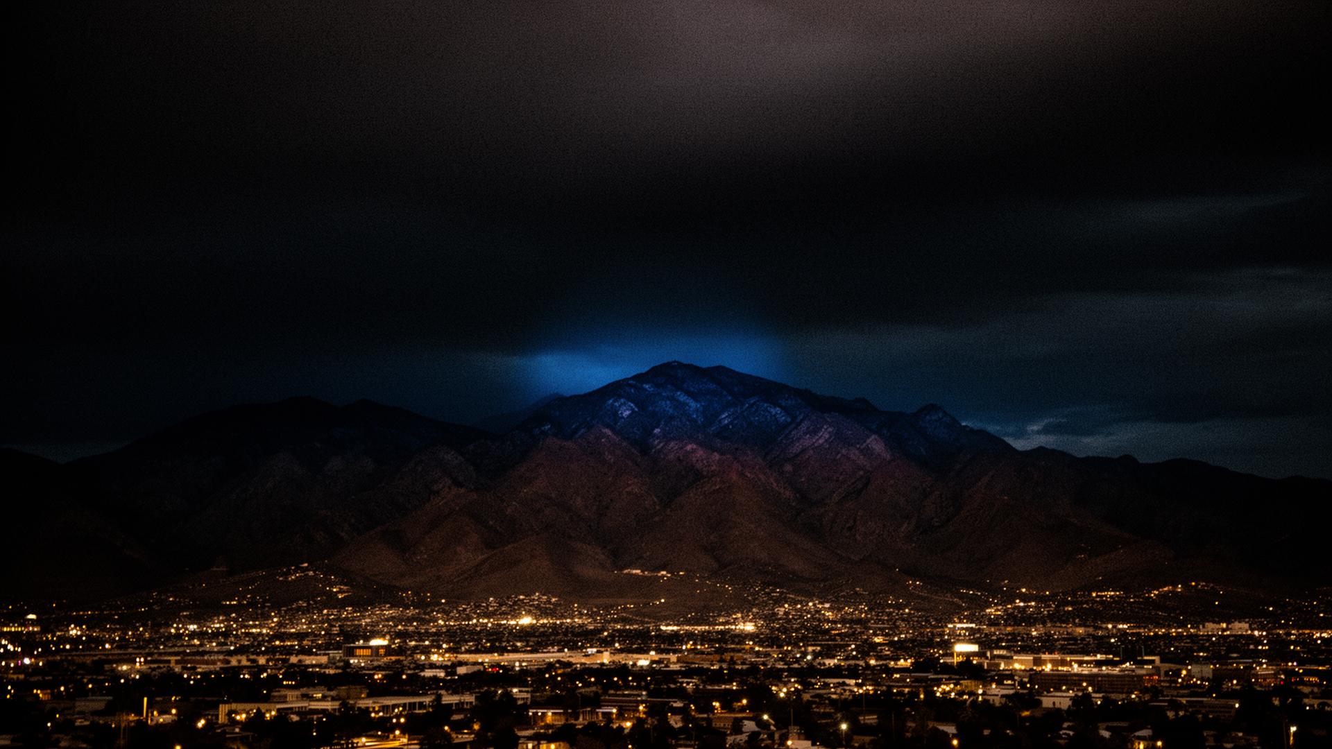
The Franklins at golden hour, the texture of stucco, the specific blue of a late-summer sky over Transmountain — these can show up in a brand as palette, photography direction, even letter-spacing. They don't need to show up as a literal illustration.
If you run a service business in Northeast or Central El Paso and your website hasn't kept pace with the work you actually do, we should talk. LumenBLU takes on six engagements a year — call (915) 330-5956 or begin a project from the contact page.
Ready to bring this level of thinking to your own site?
Why Northeast El Paso Businesses Are Quietly Outgrowing Their Websites
The 79924 and 79934 corridors are changing faster than most local websites. Here's how to tell when yours has become the bottleneck.
What a Custom Website Actually Costs in El Paso (and Why $500 Templates Cost More)
A transparent look at custom web design pricing in El Paso — and the hidden math behind the bargain template that ends up being the most expensive option on the table.